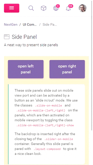
These side panels slide out on mobile view port and can be activated by a button as an "slide in/out" mode. We use the classes .slide-on-mobile and .slide-on-mobile-{left,right} on the panels, which are then activated on mobile viewport by toggling the class .slide-on-mobile-{left,right}-show
The backdrop is inserted right after the closing tag of the .slider-on-mobile container. Generally this slide panel is pared with .layout-composed to give it a nice clean look.